


Layered Masterpieces: Episode 1
Step-by-Step Exploration of an Islamic Calligraphy Artwork.

Welcome to the inaugural instalment of Layered Masterpieces, our new series dedicated to exploring the intricate beauty and profound artistry of Islamic Calligraphy.

Series Overview
In each post, we will:
Detail the step-by-step creation of a unique calligraphic artwork.
Unveil the layers that bring these masterpieces to life, from initial strokes to final elements.
The Art of Islamic Calligraphy
Islamic calligraphy transcends mere writing; it is a:
Rich and Complex Form: Each stroke and curve is rich with meaning and executed with precision.
Visual Expression of Spirituality and Culture: Showcasing artistic excellence that has evolved over centuries.
Inaugural Feature: Sami Efendi
In this inaugural post, we will delve into an exquisite calligraphic artwork by Sami Efendi, which exemplifies the harmony and elegance of the art. We'll break down each layer, providing insights into the foundation and other elements that are involved.
Embark on this discovery and appreciation journey as we:
Peel Back the Layers: Revealing the hidden craftsmanship and stories behind these calligraphic treasures.
Engage a Diverse Audience: Whether you are a seasoned calligrapher, an art enthusiast, or a newcomer to this tradition, this series promises to deepen your understanding and appreciation of Islamic calligraphy.
Join us as we explore the beauty and depth of Islamic calligraphy, one layer at a time:
Part 1: The Artwork
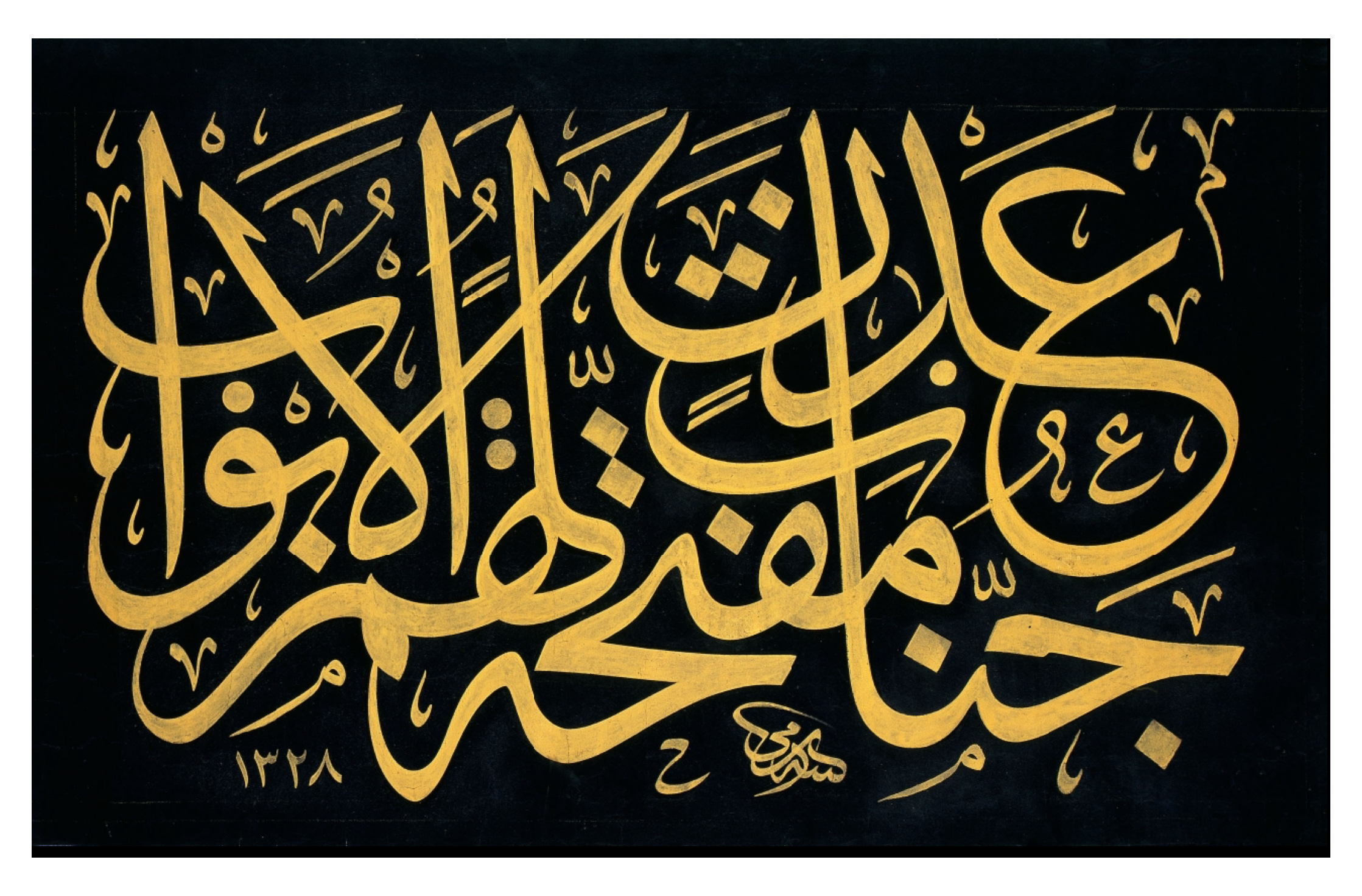
جَنَّـٰتِ عَدْنٍۢ مُّفَتَّحَةًۭ لَّهُمُ ٱلْأَبْوَٰبُ
Surah Sad, Ayah 50 (Qur’an 38:50)
(the Gardens of Eternity, whose gates will be open for them.)
This exquisite calligraphic panel by the renowned master calligrapher Sami Efendi features the Quranic verse from Surah Sad, ayah 50: "جَنَّـٰتِ عَدْنٍۢ مُّفَتَّحَةًۭ لَّهُمُ ٱلْأَبْوَٰبُ," which translates to "the Gardens of Eternity, whose gates will be open for them". This verse evokes the imagery of paradise, offering eternal peace and divine hospitality.

Sami Efendi, an expert figure in Islamic calligraphy, is known for his elegant and precise style. This artwork exemplifies his mastery of the Jali Thuluth script, a style characterized by its large, cursive letters that allow for intricate and flowing compositions.
Let’s declutter the artwork and have a look at the foundation:
Part 2: The Foundation
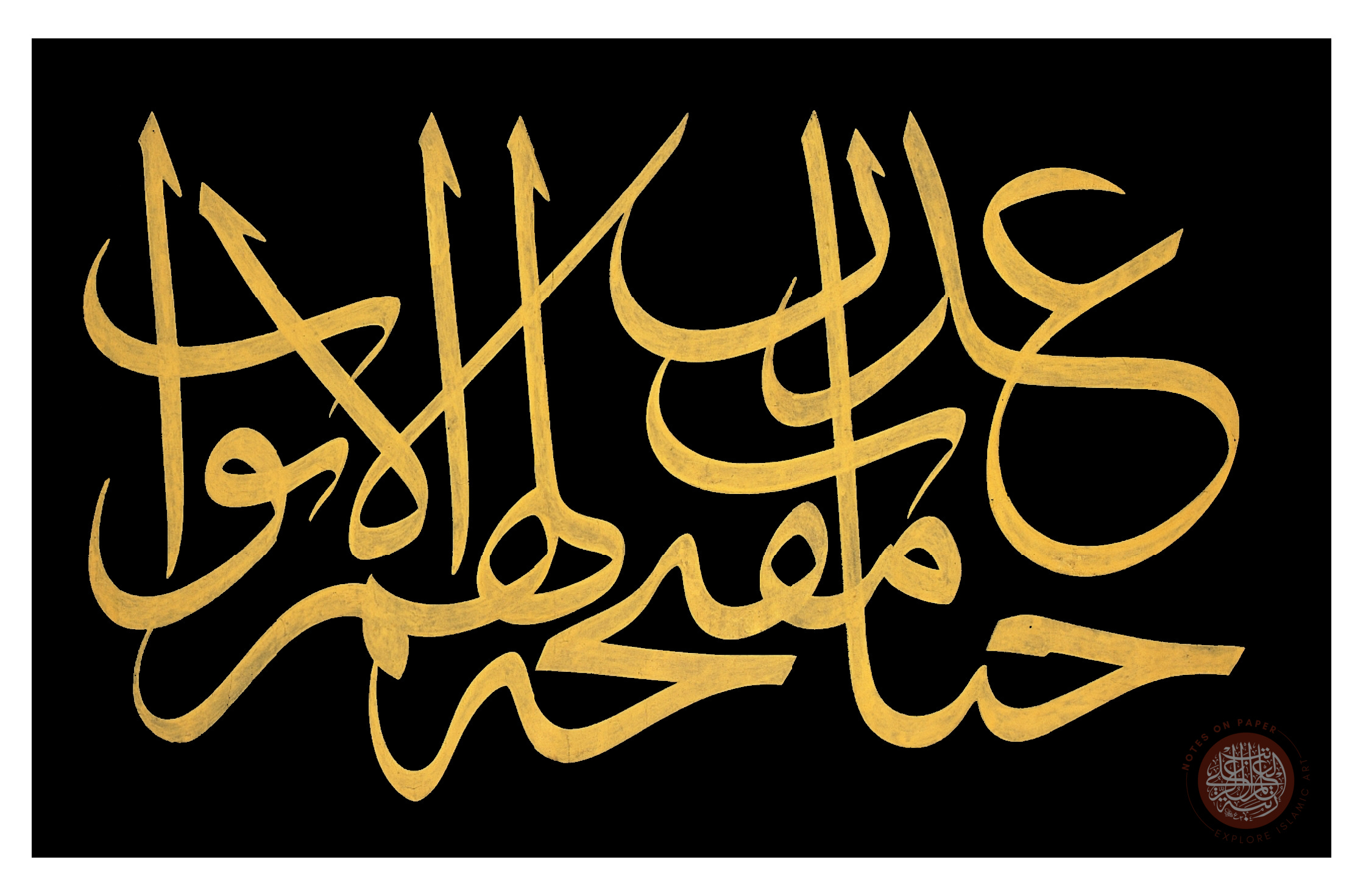
This version emphasizes the raw beauty of the letters and the foundation. It also offers a clearer view of the script's flow and the precision of each stroke.
At first glance, the letters-only version exudes a sense of fluidity and motion. The Thuluth script's graceful curves and elongated strokes create a rhythmic pattern that guides the viewer’s eye seamlessly across the composition.
It's noteworthy that nearly all the letterforms are interconnected, leaving virtually no open ends. This connectivity enhances the flow and compositional balance of the piece.
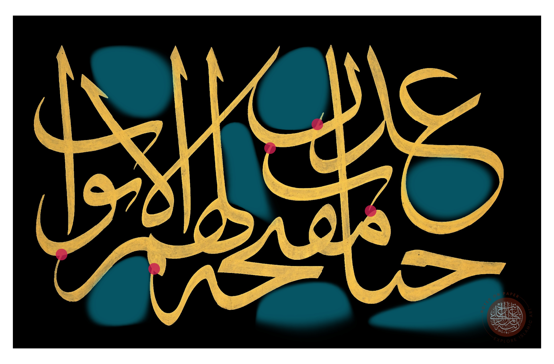
Balanced Distribution of Gaps (Marked in Blue):
The distribution of the gaps in the artwork is notably balanced, greatly facilitating the overall composition. Balanced spacing is crucial as it ensures that no part of the artwork appears overly crowded or sparse. In this piece, the even distribution of gaps makes it easier to manage the composition with minimal decorative elements needed to fill the spaces. This balance prevents any section from becoming too congested with decorations, which could disrupt the piece's harmony.
Contact Points and Flow (Marked in Red):
The contact points, highlighted by the red dots, are pivotal in guiding the viewer's eye smoothly across the artwork. These connections between letterforms create a cohesive flow, enabling the viewer to navigate the text easily. Master calligraphers often strive to avoid loose ends as they can lead to visual confusion and disrupt the readability and aesthetic flow of the piece. By ensuring that the letterforms connect seamlessly, the artist enhances the overall coherence and fluidity of the calligraphy.
Part 3: Letterforms and Distribution
In this segment, we will deconstruct the artwork by focusing on each word individually. Through a series of images, we will build the calligraphic panel word by word, guiding you through the reading process of this intricate piece.
Each image highlights a single word, eventually piecing together the original artwork. This step-by-step breakdown will reveal the structure and flow of the composition and enhance your understanding of how to read and appreciate the elegance of Islamic calligraphy.
1) جَنَّـٰتِ

2) عَدْنٍۢ

3) مُّفَتَّحَةًۭ

Quick Note: In Jali Thuluth compositions, when there isn't enough space for the traditional rhombic squares (nuqtas) within blank areas, smaller circles or multiple circles can be used instead. This technique is evident in the two circles used to represent the letter ةًۭ in this artwork.
4) لَّهُمُ

5) ٱلْأَبْوَٰبُ

6) Decorative Elements

7) Signature & Date
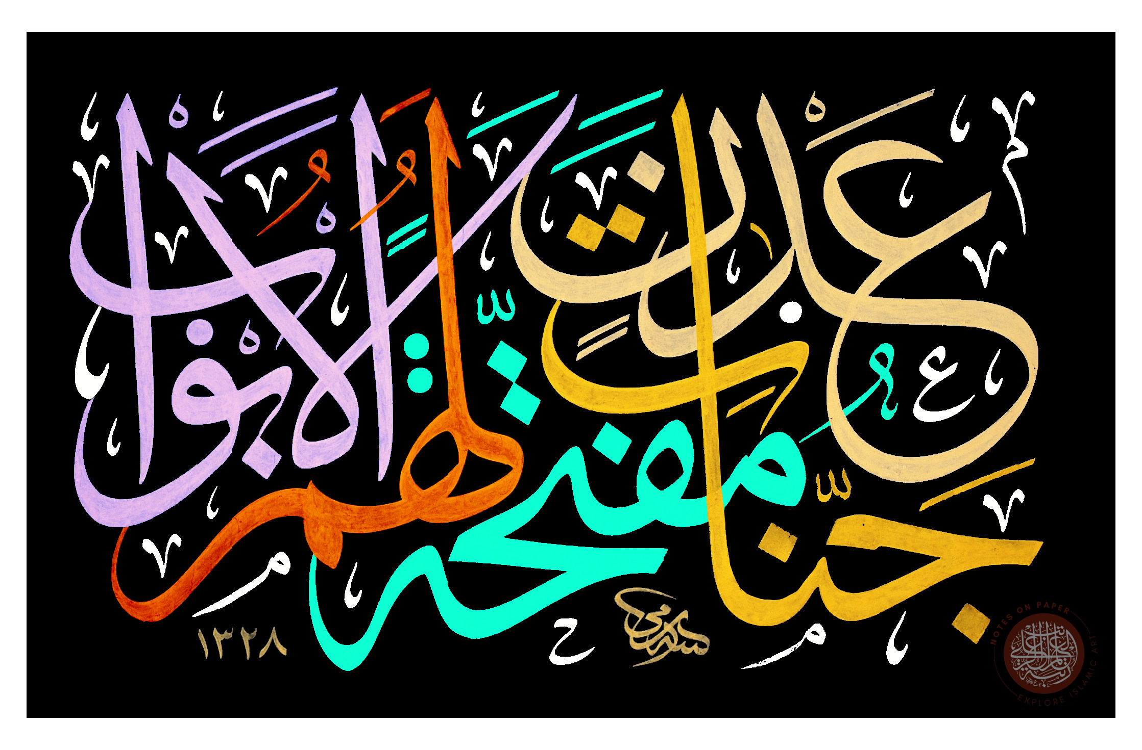
Signature: "Ketebehu Sami" (كتبه سامي) meaning "Sami wrote this"
Hijri Date: 1328 (corresponding to 1910/1911 AD)
Conclusion
As we conclude this first instalment of Layered Masterpieces, it is clear that the art of Islamic calligraphy is not merely about putting ink to paper; it is a profound meditation on beauty, precision, and spirituality. By dissecting the layers of Sami Efendi's masterful work, we gain insight into the technical aspects of calligraphy and a deeper appreciation for the cultural and divine inspiration that drives this art form.
Through this series, we hope to continue uncovering the nuanced details and the rich symbolism embedded in each artwork. We invite you to join us in the next episode as we explore another magnificent piece, unravelling its story and the hands that crafted it.
Thank you for embarking on this journey with us. Stay tuned for more insights and discoveries in Islamic calligraphy, where every line and curve has a story.