

Decoding the Tughra: Anatomy of an Imperial Monogram
Using the Signature of Sultan Abdülhamid II as a Guide.

In the first part of our Tughra Series, we explored the origins and evolution of these majestic imperial signatures — how they emerged as royal emblems, how their form developed over time, and what they came to represent within the Ottoman world. But understanding their historical importance is only the beginning. To truly appreciate a tughra, one must learn to read its form — to decode its elegant structure and see how lines, curves, and calligraphic gestures come together in a harmonious visual language. In this second installment, we’ll take a closer look at the anatomy of a tughra. What are its essential parts? What do they symbolize? And how did master calligraphers manage to fit each sultan’s identity into this intricate yet standardized design? Let’s break it down — stroke by stroke.
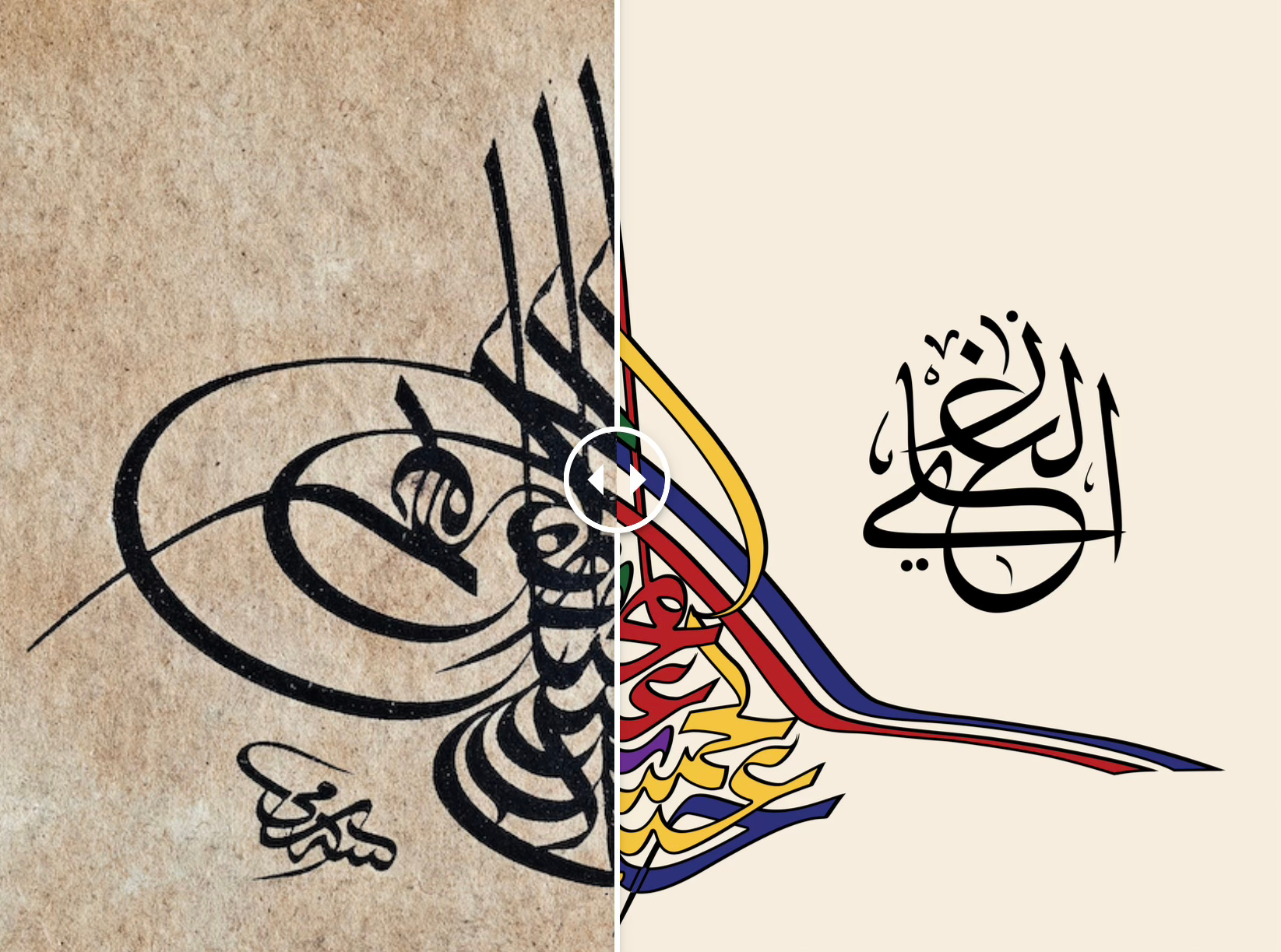
In this second installment, we’ll take a closer look at the anatomy of a tughra using the imperial monogram of Sultan Abdülhamid II as our guide. What are its essential parts? What do they symbolize? And how did master calligraphers manage to fit each sultan’s identity into this intricate yet standardized design? Let’s break it down — stroke by stroke.
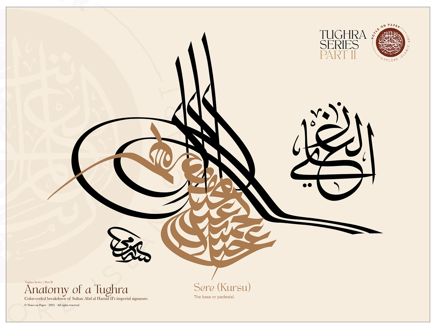
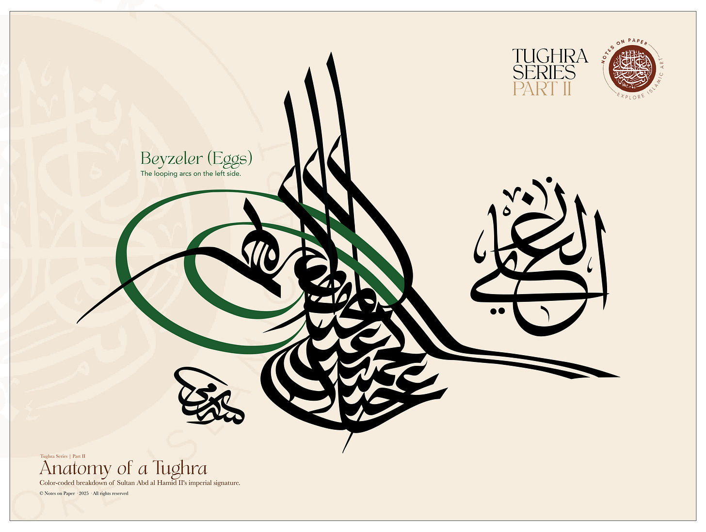
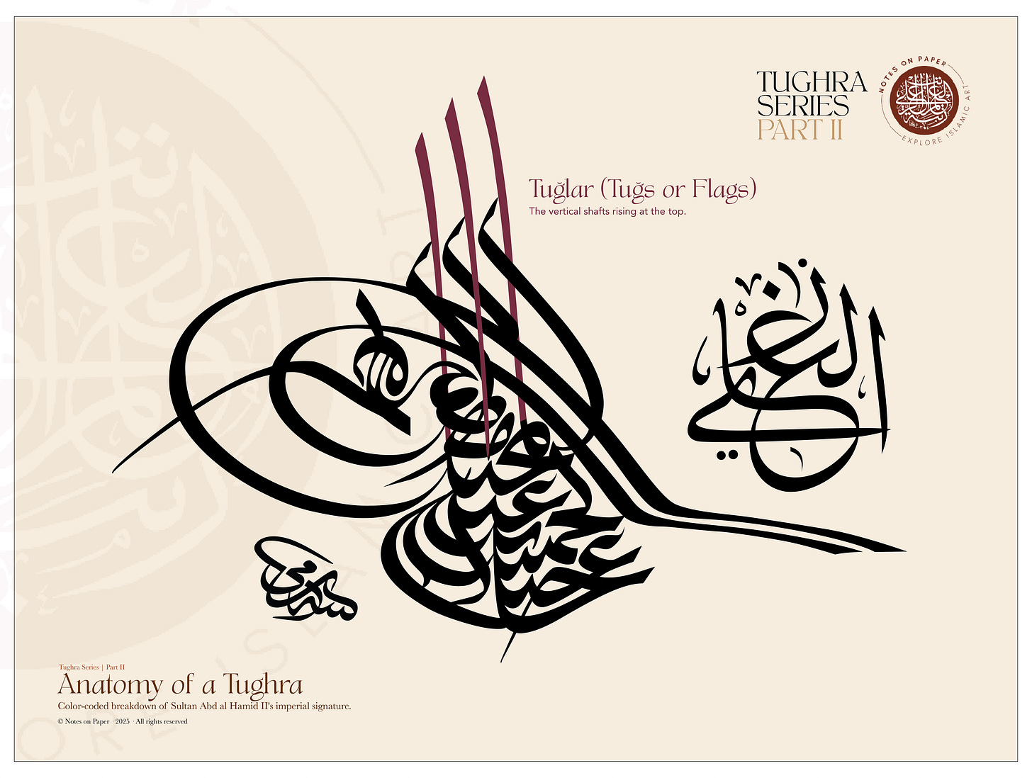
Parts of the Tughra
Sere (Kürsü) – This is the solid bottom section of the tughra, like its foundation. In Sultan Abdülhamid II’s tughra, the sere contains his name “ʿAbd al-Ḥamīd Khān,” his father’s name “bin ʿAbd al-Majīd,” and the honorific phrase al-muẓaffar dāʾiman("ever victorious"). Though the shape evolved — from straight lines to more triangular or talon-like forms — its function remained the same: it’s where the sultan’s full titulature is laid out.
Beyzeler (Eggs) – The looping arcs on the left side. Beyze comes from the Arabic word for “egg.” In a tughra, it refers to the two large oval loops that swell to the left of the design. These are formed by the sweeping tail of certain letters – specifically the curled “n” (nun) in words like bin and han. In most tughras you’ll see two concentric oval loops, one inside the other, creating a distinctive double curve. Some sources poetically interpret the beyzeler as symbols of the empire’s reach – for instance, one 19th-century commentary fancifully suggested the larger loop represented the Mediterranean Sea and the smaller loop the Black Sea under the sultan’s dominion. Whether or not the Ottomans themselves intended that meaning is unclear, but it’s a charming interpretation! In any case, the beyzeler give the tughra much of its visual bulk on the left. (They were so emblematic that in Ottoman slang, people even called a certain style of calligraphic decoration “beyze” because it looked like these loops.)
Tuğlar (Tuğs or Flags) – The vertical shafts rising at the top. These are the three tall, bold strokes that shoot upward from the base of the tughra. They almost look like three flagpoles, which is fitting since tuğ originally refers to a horse-tail banner or standard (a sign of rank in Turkic tradition). In tughras, the tuğs are usually drawn as elongated Arabic letters – often an “alif” or “lam” – but stylized to just be long vertical lines. They give the tughra its upward thrust and a sense of majesty, as if proclaiming the ruler’s name to the skies. Notably, the three tuğs are not all the same height; typically the middle one is the tallest, and the outer ones a bit shorter, creating a slight asymmetry that adds to the visual rhythm .
This staggered height is no accident – it creates a kind of hierarchy and pleasing balance in the design. Some historians also saw symbolic meaning in the number three (for example, linking it to the three continents – Europe, Asia, Africa – over which the Ottomans at one point ruled, or other triads). At the very least, the three tuğs became a defining feature of the Ottoman tughra (earlier Turkic states sometimes had just two). They often represent the sultan’s independent authority – a triad of power, so to speak.
Zülfe (Zülfeler) – The feathered curls to the sides of the tuğs. If you look closely at a tughra, the tall tuğ strokes aren’t plain straight lines – they often have little curving appendages on their sides, like pennants wafting from a flagpole. These curvy side extensions are called zülfe, meaning “locks (of hair)” or “tresses,” because they have a flowing, tassel-like shape. The zülfe usually curl outward to the left side, ending in a flourish. According to some writers, the way the zülfe curls to the left (westward) symbolized the Ottomans’ expansion from east to west – like a breeze blowing westward . In essence, the tuğs and zülfe together make the tughra look a bit like a bouquet of tulips or a set of banners fluttering, adding dynamism to what is, after all, writing. They are purely ornamental in function, but crucial to the tughra’s aesthetic.
Kol (Hançer) – The “arm” or dagger shape extending to the right. This element looks like a long horizontal stroke or tail that extends out from the base of the tughra toward the right, often slightly diagonal or sloping downward. It’s sometimes called hançer, meaning “dagger,” because of its shape – imagine a sword lying along the bottom right of the tughra. The kol originates from the continuation of letters in the tughra’s text, but it also serves to underscore the whole composition and balance the big loops on the left with a long line on the right . Visually, it’s like the tughra’s horizon line. In many tughras, this rightward line is drawn with a slight curve or thickening, giving the impression of a blade. Symbolically, some say it represents the sultan’s sword – a reminder of military might – drawn beneath his name. This horizontal stroke often ends in a sharp point or tapered tip, enhancing the “dagger” look.
In Abdülhamid II’s tughra, it often slopes slightly and ends in a tapered tip, visually resembling a sword. While it originates from the final letters of the phrase al-muẓaffar dāʾiman, it also serves to counterbalance the beyze.


These components – the sere (base text), beyzeler (loops), tuğlar (verticals), zülfeler (curls), and kol/hançer (tail) – together form the anatomy of a tughra. Every Ottoman tughra from the 16th century onward contains all of them in some fashion. The challenge for each new sultan’s calligrapher was to take the names and titles of that sultan (which could be long or short) and fit them into this template gracefully . This was no small task; some names were longer, some shorter, yet the tughra had to maintain the classic look.
The calligrapher might stretch certain letters into the tuğs, enlarge or shrink the loops, or add ornamental swirls to fill space, all while keeping the tughra legible and aesthetically balanced. As one source put it, they had to “make every sultan’s name befriend the shape” of the tughra – a true art of composition.
Reading the Tughra
But knowing the structure alone isn’t enough — a tughra is more than just elegant curves and compositional balance. It is, at its core, a written name — a highly stylized form of Arabic calligraphy that still carries meaning, if you know how to read it. So, how do we actually decipher what it says?
Let’s take Sultan Abdülhamid II’s tughra as an example and look at how the words themselves are woven into this visual emblem.


A Composition of Mastery
It’s also worth noting that while the overall shape was consistent, tughras weren’t carbon copies. Especially on high-polish versions (like those decorating imperial edicts or plaques), artists would add extra decorative patterns inside the shapes – for example, filling the beyzeler with tiny gold vine scrolls or floral designs, as seen in Suleiman’s tughra. These embellishments made each tughra a unique visual delight. Some later tughras even included a tiny motif of the sultan’s tuğra again inside the tuğra (tughraception!) or other symbolic miniatures, purely as artistic flair.
Closing Note
To sum up, a tughra is both text and image, name and proclamation. “ʿAbd al-Ḥamīd Khān bin ʿAbd al-Majīd Khān, al-muẓaffar dāʾiman” is not simply written — it is crafted into a visual anthem of sovereignty. Now that we’ve broken down the form, we’re ready to explore where these imperial signatures were placed, how they were used, and what legacy they left behind. Understanding the structure helps us appreciate how cleverly these elements were woven together.
Now that we've uncovered the structure of the tughra, in the next episode we’ll explore how and where these imperial signatures were used — from firmans and coins to architecture and official seals.
Stay tuned for the next episode!
Interesting Article.
I’m very happy I came across your very interesting paper on Tughras! On a long visit to beautiful Türkiye 35 years ago, I found a few cards with tughras on them - they were stunning - much gold and wonderful calligraphy. I couldn’t bear to part with them; all from various Sultans. Hmm - I think I shall frame them and hang for all to see. Thank you so much and best wishes for the future.
,